
A tentative definition of ‘shy’ design.
The design blogs overflow with bold, overtly distinctive work. Linguistically charged projects that announce themselves before you even see them.
I'm interested in something else entirely.
I call it shy design—a practice where making and finding aren't separate acts but a single, intertwined process. The word "shy" predisposes you to a less forceful posture. It suggests stepping back rather than imposing forward.
This isn't about passivity. It's about recognizing that digging and uncovering leads to fundamentally different solutions than declaration and force.
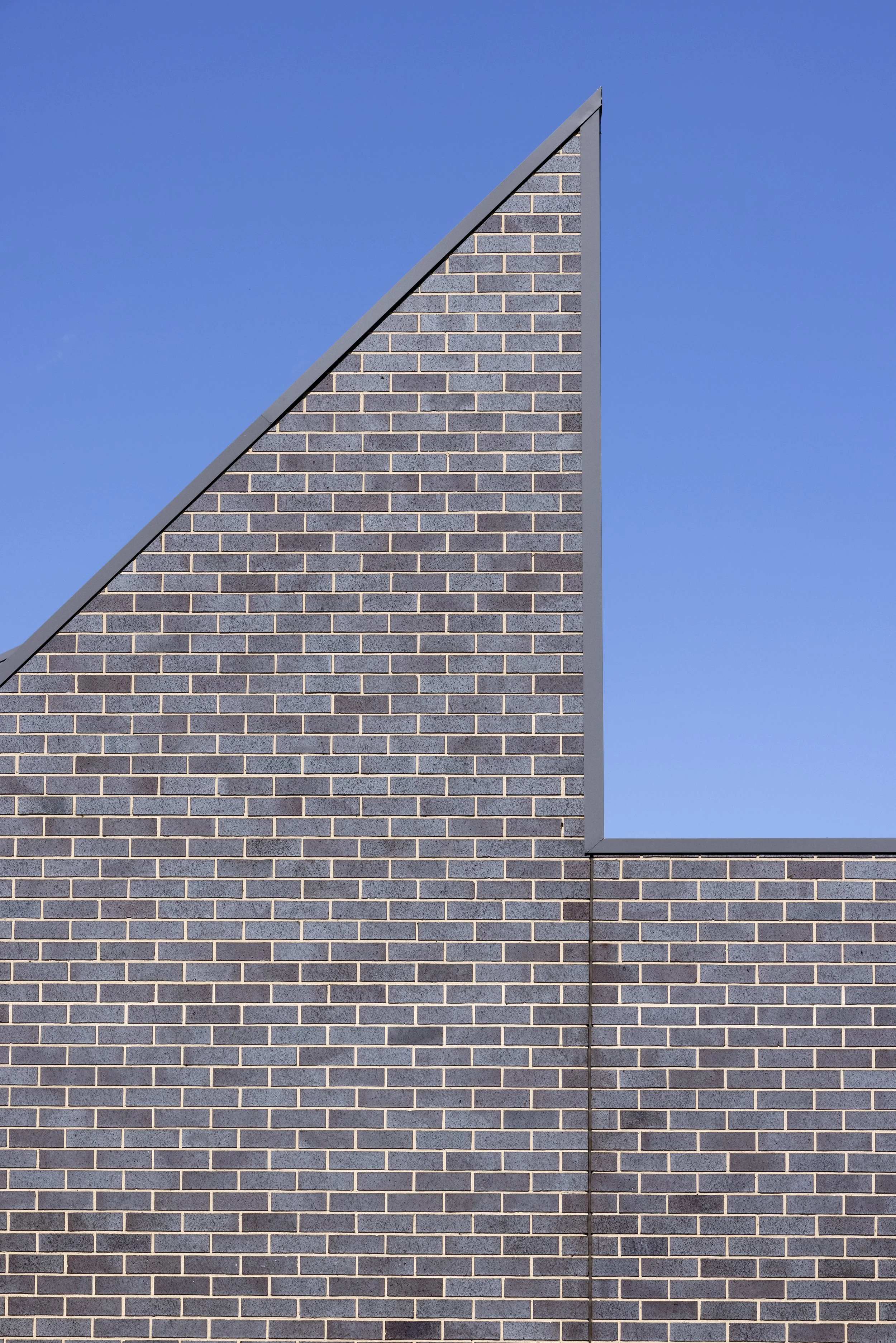
The Temptation of the Visual Stamp
Imposing a visual stamp on a building is tempting. I've done it from time to time.
But it's problematic for my practice.
What I prefer is letting the plan and the logic of the building speak for itself, allowing it to shape the visual dimensions of the work. This approach is tricky. It doesn't always work.
Design scholar Joshua Noble captures this distinction perfectly: "What good design does is discover latent capabilities and capacities." When designers "stay in the discovery mind-set we stay curious about the world and what we can uncover within the way that humans move in it rather than myopically focusing on problem-solving."
When this approach fails, you end up with a design determined by the wrong factors. Letting the intrinsic logic of a plan or design guide the work requires careful editing and curation. You can't just throw rooms together and hope it adds up to something.
The System of Values
Distinguishing between editing what you've uncovered versus imposing your own visual stamp comes down to a system of values—an engine with various moving parts.
You need to feel your way through it.
I've completed some good buildings and some bad buildings. The difference usually reveals itself through the attention given to the elements and the way they fit together.
The critical skill is learning to identify which patterns are noise and which are signal.
Signal patterns lead to a coherent, logical schema for the architecture. Noise patterns look initially like they'll do this, but they turn out to be dead ends. The key is following the pattern all the way to the end, then working backwards to another signal pattern if you get stuck.
Why You Can't Spot Dead Ends Earlier
Spotting dead ends earlier is a matter of experience and practice.
There's no substitute for long and hard experience at the virtual drawing board. You can become quite adept at identifying the fruitful, fertile signal patterns if you keep at it for many years.
There is no way to shortcut this.
Research on design process confirms this reality: "Experienced creatives tend to have a smooth and clear process that they refined over time, whereas beginners often trip up on project discovery, or in some cases, skip over it entirely."
It's a confession, but this process takes patience and close attention. Sometimes things have come to fruition that didn't get my full attention. They're easy to spot—at least to me. This isn't ideal, but life is busy and sometimes design doesn't get the attention it desperately needs.
The Telltale Signs of Insufficient Attention
Buildings over-determined by their plan, where the plan isn't shaped with a clear spatial logic, can result in incoherent three-dimensional building forms.
I won't point out where we've done this, but it's apparent to a close observer.
Other times—the majority of the time—we've got it right.
The paradox here is worth examining. I advocate for letting the plan shape the work, yet there's a version where the plan determines too much. What's the difference between a plan that properly shapes the work versus one that over-determines it?
The Push and Pull
Plans are a push and pull, like this whole process.
At first, you just throw rooms together to get a sense of the occupation of the site. That's the push—the process of discovery.
Then, alternatively and iteratively, you intervene and shape the plan consciously. This is the pull—the intentional design of the shape, pattern, and logic of the plan.
Recent design methodology research validates this approach: "When it comes to practical appliances in the daily design work, the Discovery and Concept Design phases are inseparable." Discovery enables designers "to translate information into solutions that are profoundly informed by the Discovery findings."
You need to tease the threads out. How much you allow the plan to push in a certain direction exists in dynamic tension with the process of making and shaping.
The North Star: Simplicity
When a simple pattern begins to emerge, you know you're on the right track.
This is the North Star: the plan and the design overall begin to form a simple, clear diagram. It's a process of distillation.
Knowing when to switch between discovering and shaping modes comes from watching for this emergence. When simplicity starts to reveal itself, you're moving in the right direction.
But here's where things get interesting.
People often assume that because I pursue simplicity, I'm at odds with the design industry's celebration of complexity and boldness. That's a misconception.
Even a complex, bold, and distinctive design has simplicity at a conceptual level. The visuals and the trappings—the form itself—may be complex, but if it's good design, there will be a thread of conceptual simplicity at some level or scale.
Discovered Simplicity vs. Designed Minimalism
The difference between my approach and stylistic minimalism is fundamental.
Simplicity and minimalism are a world apart.
Minimalism is the unthinking person's "simplicity." It looks simple because there may be large abstract surfaces and fewer moving parts, but true minimalism is exceedingly rare. A lot of what gets promoted as minimal—and there isn't much, really—is merely banal.
True simplicity can contain layers and density while appearing obvious, or even ‘inevitable’. That's what I mean by simple.
Architectural scholars studying minimalism note that "simplicity is not minimal variation but a means of allowing deeper qualities to be revealed—light, shadow, proportion, pattern, sound, silence, the weather." This distinction between discovered simplicity and stylistic minimalism resonates with the shy design philosophy.
British minimalist architect John Pawson believes that "through reduced clutter and simplification of the interior to a point that gets beyond the idea of essential quality, there is a sense of clarity and richness of simplicity instead of emptiness."
My approach of shy design lets that simplicity show on the surface rather than hiding it beneath visual complexity. That's the whole point.
Enduring vs. Instagram-Worthy
The choice comes down to creating something enduring versus something momentarily Instagram-worthy but not lasting.
Oliver Wainwright, architecture critic for The Guardian, reports that "many studios now openly admit 'Instagrammability' is at the forefront of their concerns on new projects, with clients requesting designs that will look great on social feeds."
The problem? "'Instagrammable' moments get written into briefs, encouraging perspective-driven corners that can pivot to trends. Too often, project success is judged by online reaction" resulting in "design by metrics—optimized for engagement rather than for daylight, circulation, longevity, or care."
I've imposed visual stamps from time to time, succumbing to this urge even when it is not my thing. Sometimes time intervenes and demands that you resolve a building visually with a coherent pattern that's somewhat more imposed than I'd like it to be.
The fact is, it's easier to make a visually distinctive building than to make an intrinsically simple and enduring piece of architecture that will give back consistently to its users.
Such buildings may not be good for social media or marketing visually, but they're what drives my practice: the people who will use the building, either visually—walking past it—or as occupants.
The Harder Path
Most architects and designers would agree that simplicity is much harder to achieve without lapsing into banality.
I haven't always got it right, but the simple is prized among good designers.
The harder path—the one that requires patient listening and signal-finding—produces something that gives back consistently to users in ways the easier path doesn't. Many good practitioners exemplify this, and there is nothing visually common to their work: it is diverse, but consistently good.
Research on design process found that "the more time you spend on a discovery, the more details you'll find about a problem you solve, the better solution you will find." This supports the reality that there's no shortcut to the years of experience needed to spot fertile patterns.
William Duggan's research on creative strategy found that innovation happens through "discovery" where "you search for examples elsewhere that solved each element" and "you then see a subset of examples that come together in your mind as a new combination that solves the problem."
This empirical backing supports the claim that shy design discovers rather than declares.
What Shy Design Reveals
Shy design reveals something about our industry's relationship with performance and declaration.
When you step back from forceful invention, when you predispose yourself to a less aggressive posture, you create space for what's already there to emerge.
You're not just being less "authored" visually. You're allowing the work to be more generic in the best sense—more connected to its essential nature rather than your signature.
The process requires feeling your way through a system of values, following patterns to their conclusions, learning to distinguish signal from noise through years of practice.
It means accepting that some projects won't get the full attention they deserve. That you'll create some buildings that are over-determined by their plans, or something else - that lack clear spatial logic, that result in incoherent or less convincing three-dimensional forms.
But when you get it right—when the push and pull of discovery and making achieves that simple, clear diagram—you create something that gives back consistently.
Not something that performs for the camera.
Something that endures for the people who move through it, day after day, year after year.
That's the practice. That's what I'm after.
Less obvious. Less authored. More mundane, in the literal sense of the word.